

No items found.
Create a visual identity rooted in rural craft for Pradenn and redesign their site, building a graphic expression that is simple, authentic, and true to this committed collective.
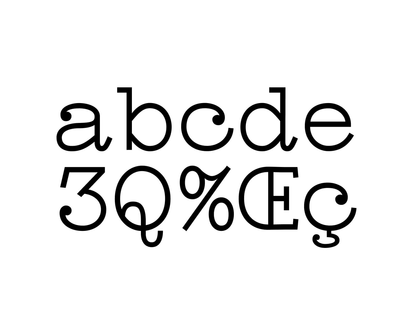
Pradenn champions a collective, artisanal approach to farming and food, through its farm, bakery, and canteen. To translate these values, the graphic identity relies on strong, sensitive choices: a linocut technique evoking manual gestures and raw materials, and the Compagnon typeface as the project's central element. With its frank yet expressive drawing, it rightly embodies the authenticity, rural roots, and human dimension running through all of the collective's activities.