No items found.
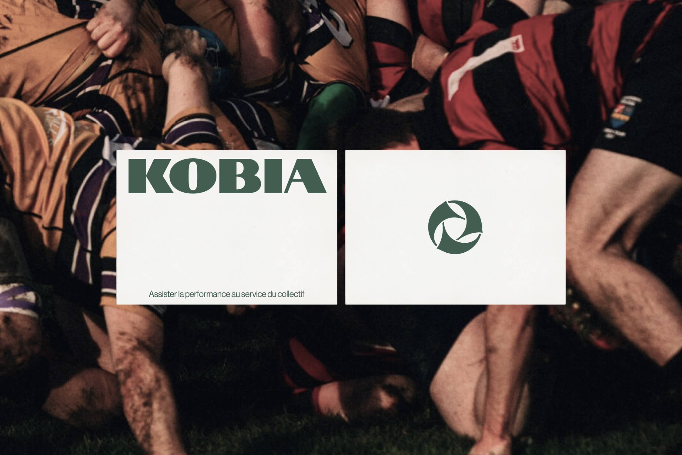
Design Kobia's visual identity, giving shape to the fusion of collective strength and athletic performance for a sports performance platform built for amateur clubs.
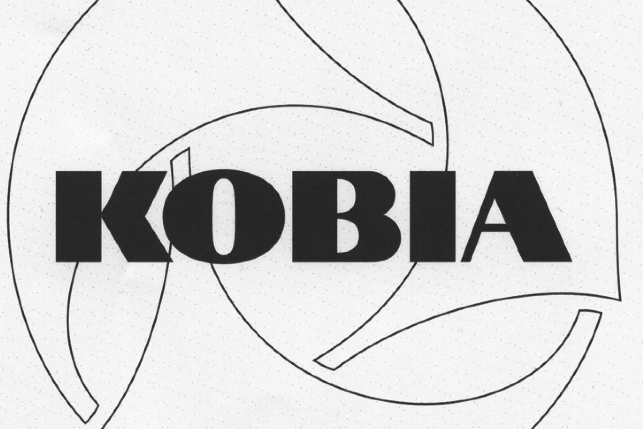
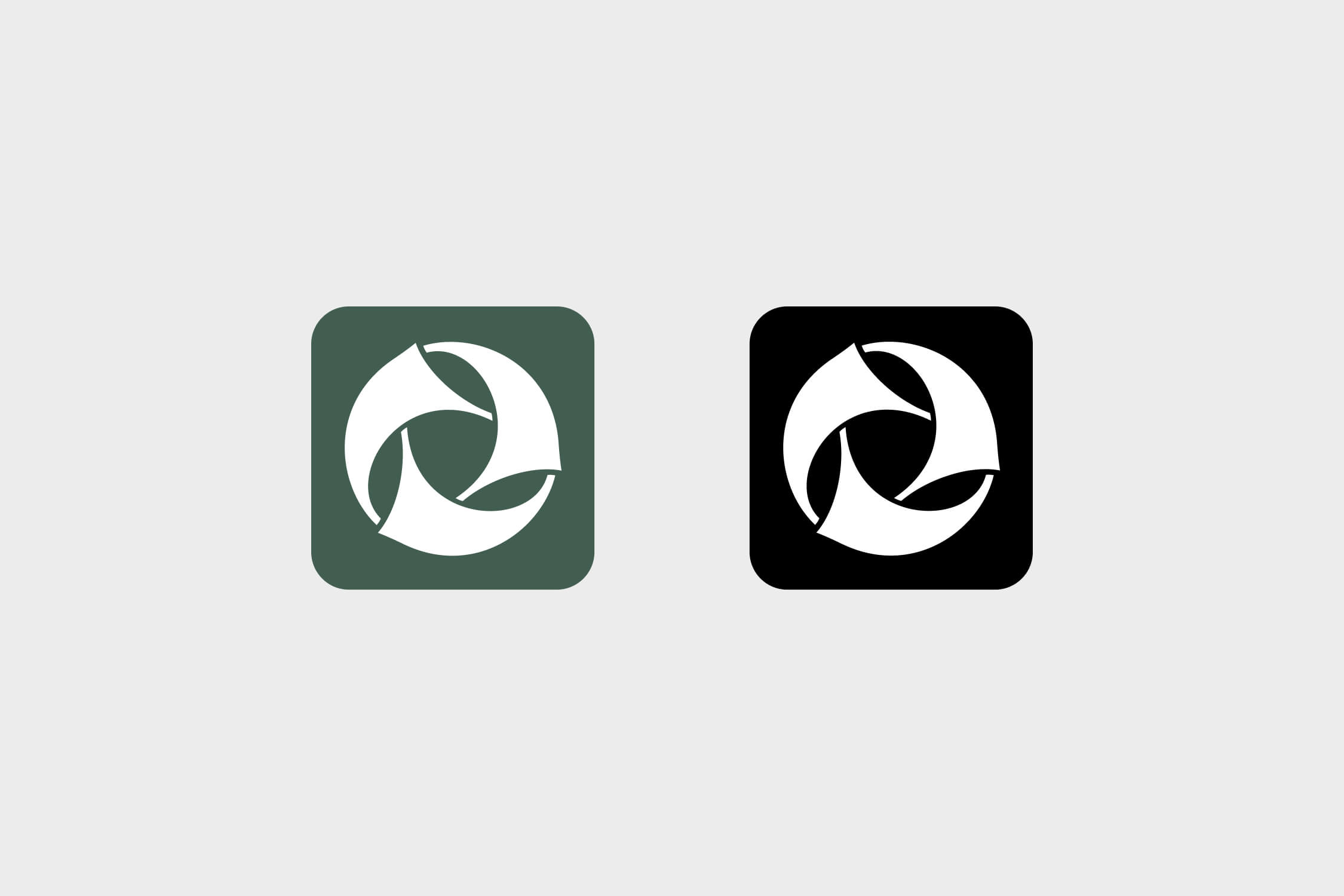
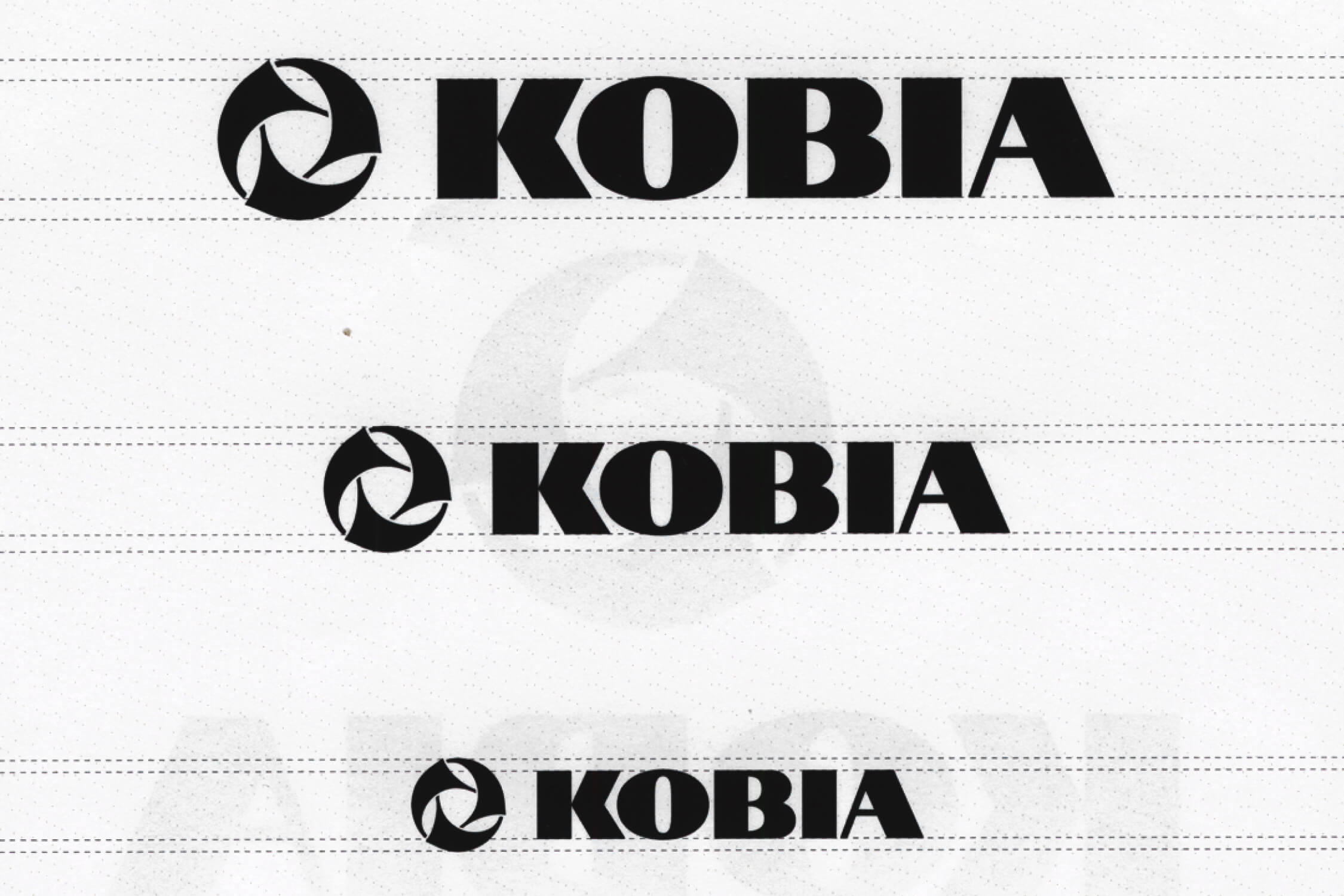
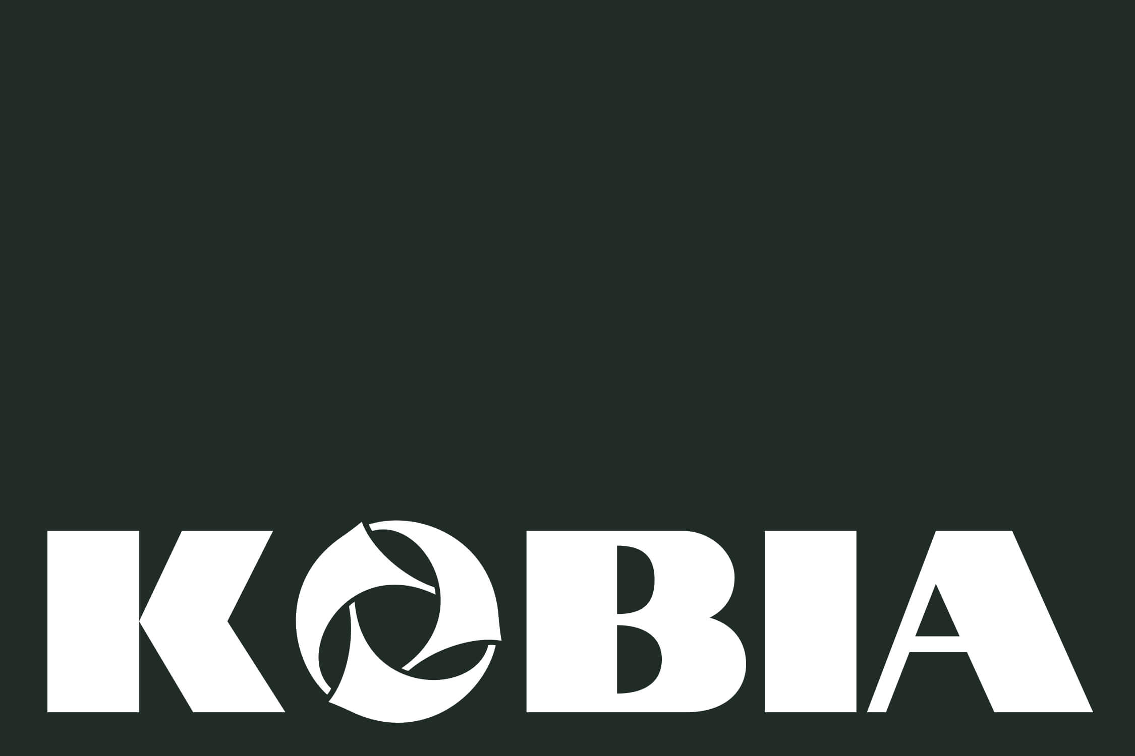
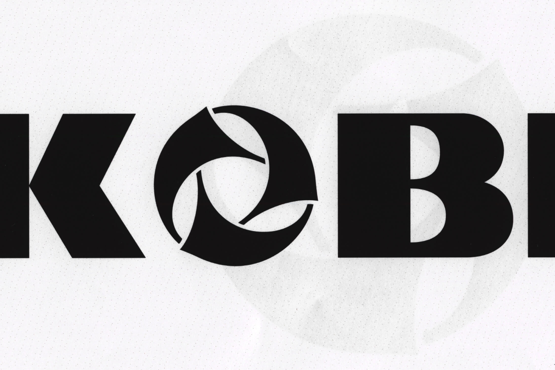
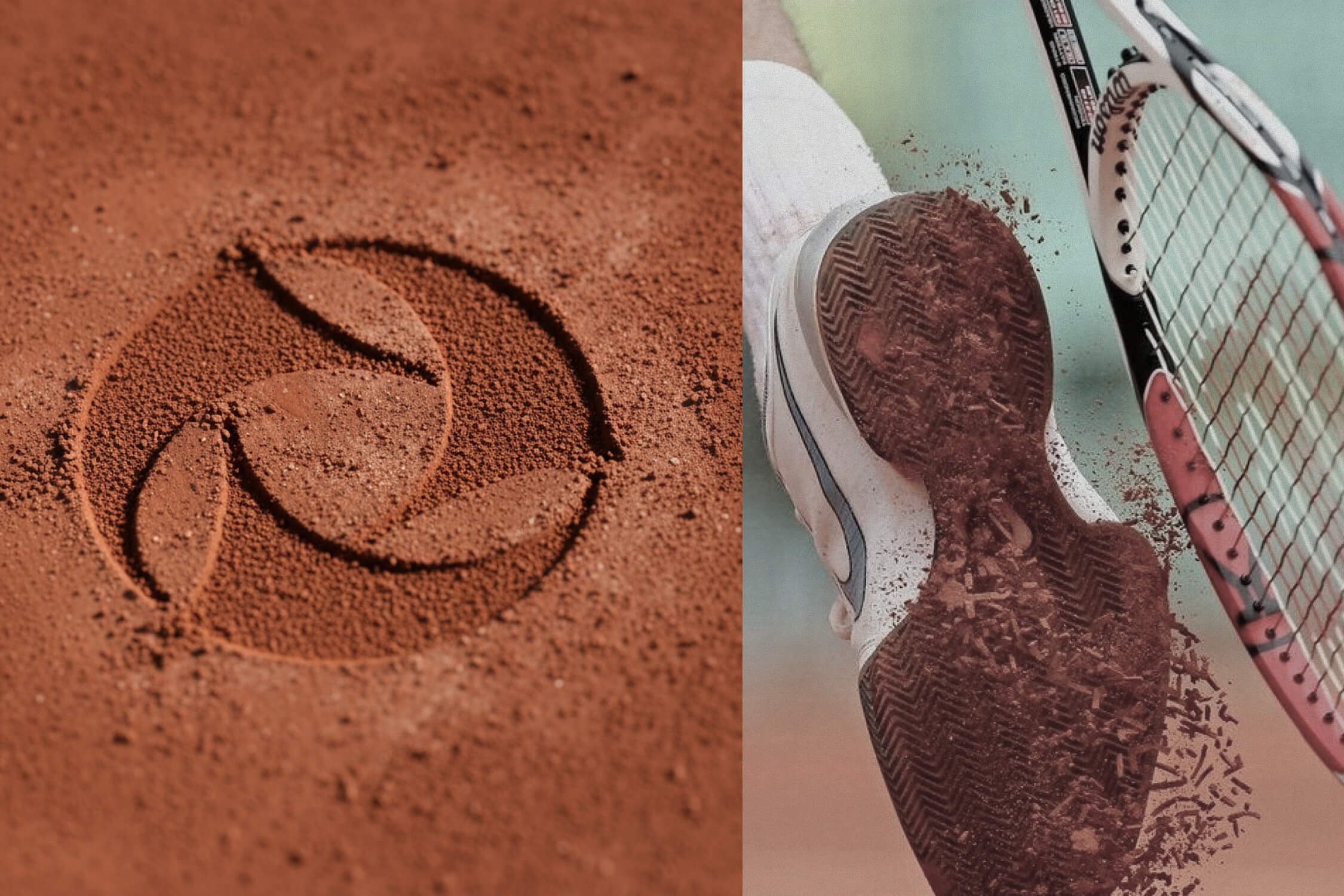
The icon translates the brand's name literally: three koru, the Maori fern symbolizing growth and renewal, rotate together inside a circle, individual paths that turn as one and close the movement into a loop. The circle also frames a hidden crest, because joining Kobia means entering a privileged circle, not simply adopting a tool. The wordmark answers with a full weight and a sharp accent on the K, enough presence to stand alone. Icon and wordmark share the same geometry, one does not go without the other.